We were tasked with creating a logo for a high-end hair salon. As a Licensed Cosmetologist, I found this to be an especially fun project! I graduated from a Paul Mitchell school and am loyal to the brand. I have always loved their simple and bold black/white logo. I wanted to make sure my logo had the same type of feel to it. The color psychology of black is powerful and sleek, perfect for my fashion-forward target audience of celebrities and young professionals in LA. Adding green to my design was chosen to give some gentle humanizing contrast to the stark black/white while appealing to the color psychology associated with both wealth and relaxation.
Tool: Photoshop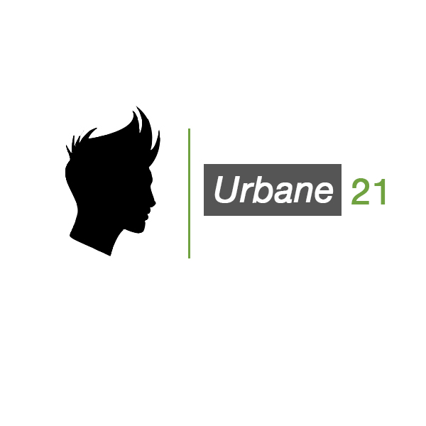
I placed a simple silhouette and cut it out. I flipped it so it would be facing the lettering. I adjusted the kerning slightly so it would sit well and draw the eye across the gray back box to the end of the salon’s name — Urbane 21. Celebrities and young professionals would both want to be trendy, yet suave and put-together. So I chose the word URBANE, because it gives off an urban vibe, in addition to its true meaning (suave, elegant). I used a version of Helvetica to keep it simple and very legible.
Here I reversed the whites and blacks to demonstrate a different possible look for the logo.
![]()
And lastly, I created a graphic-only favicon using the signature Urbane green behind the style silhouette.

